The Brand of Sacrifice Tattoo Ideas from Berserk has become an iconic symbol for fans worldwide. This haunting mark resembles an elongated triangle with intersecting lines forming what appears to be a branded neck. It carries profound meaning within the series and makes for a powerful tattoo choice.
1. Traditional Black Outline
The simplest yet most faithful rendition stays true to the manga’s depiction.
A clean black outline placed on the neck or trapezius muscle creates an instantly recognizable tribute.
Many fans prefer this minimalist approach cuz it captures the raw essence without unnecessary embellishment.
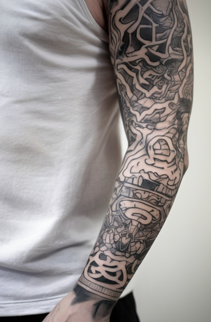
2. Bleeding Brand
This variation incorporates red ink that appears to drip from the lines of the brand. It represents the supernatural bleeding that occurs in the story when demons are near.
This style works particularly well as a larger piece on the upper arm or shoulder blade.
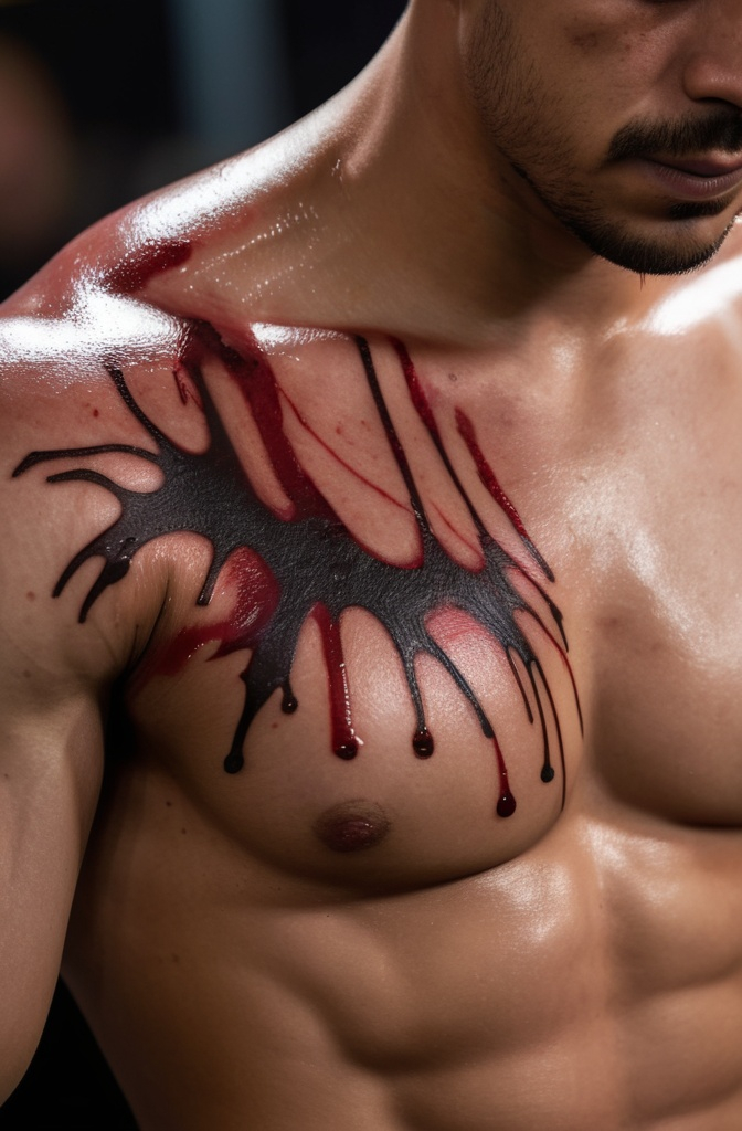
3. Weathered/Scarred Brand
A weathered interpretation gives the impression that the bearer has carried this curse for years. Tattoo artists use shading techniques and strategic highlights to create the illusion of scar tissue.
This approach incorporates subtle skin tone variations and textured linework to mimic an actual brand.
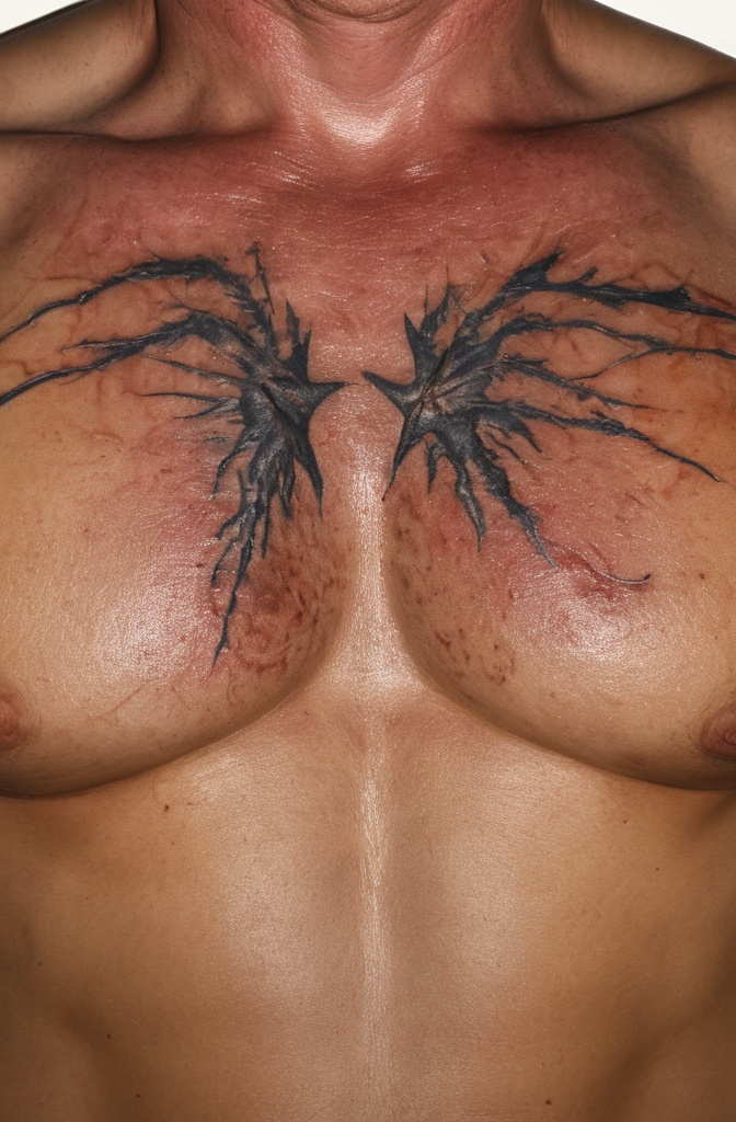
4. Glowing/Ethereal Brand
Some fans opt for a Brand of Sacrifice that appears to glow with supernatural energy. Using white highlights, subtle color gradients, and even UV-reactive ink creates the impression of mystical activation.
The ethereal quality can be enhanced by adding wispy smoke effects or an aura surrounding the brand.

5. Brand Within Behelit
True Berserk enthusiasts might appreciate incorporating another iconic symbol the Behelit. These face-like talismans play a crucial role in the story’s cosmology.
Imagining the Brand carved into or emerging from a Behelit creates a deeply meaningful composite for dedicated fans.
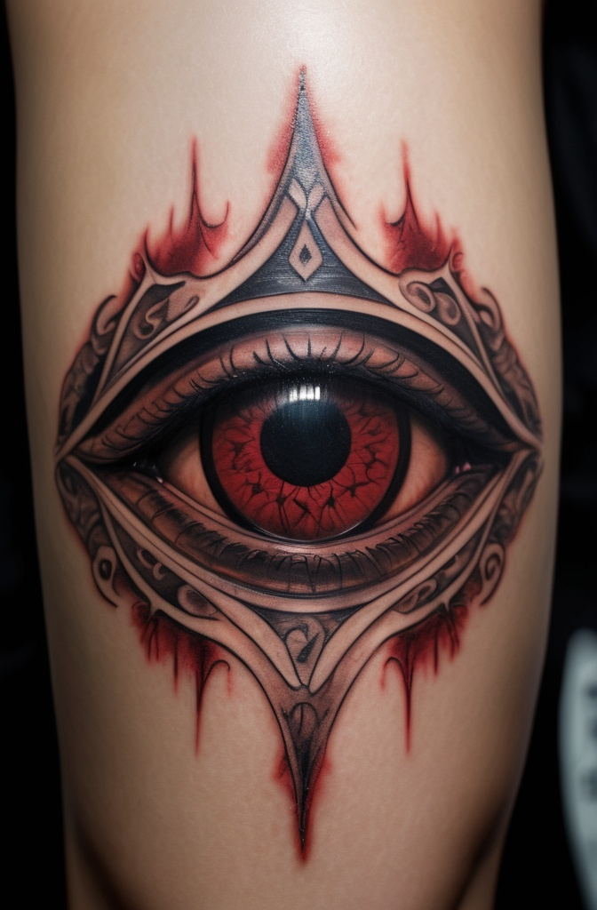
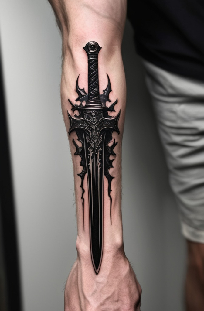
6. Dragonslayer Hybrid
Combining the Brand with Guts’ massive sword creates a powerful homage to the series’ protagonist. The brand can appear etched into the blade or positioned behind the sword.
It’s a perfect choice for fans who identify with Guts’ refusal to accept the destiny imposed upon him.
7. Eclipse Scene Silhouette
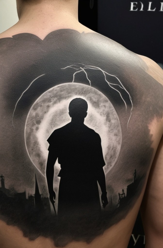
The Eclipse the cataclysmic event where the Brand is introduced provides rich visual material. Some fans incorporate silhouettes from this infamous scene with the brand positioned against a backdrop of demonic figures.
Dark red accents against black silhouettes create a striking blood moon effect that evokes the horror of the Eclipse.
8. Geometric/Abstract Interpretation
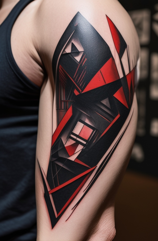
Geometric or abstract interpretations maintain the essential shape while reimagining them through precision and dot work. This approach appeals to fans wanting a less obvious anime reference.
It works particularly well in visible locations where the clean lines can be fully appreciated.
9. Brand with Japanese Calligraphy
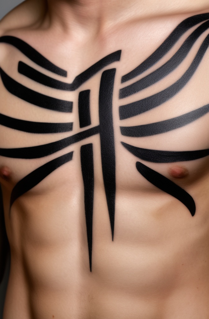
Incorporating Japanese calligraphy alongside the Brand creates a culturally resonant piece. Phrases like “欲望” (desire), “犠牲” (sacrifice), or “闘争” (struggle) complement the brand while adding layers of meaning.
The combination of stark symbol with flowing brushstrokes creates a balanced composition honoring both visual and philosophical aspects.
10. Brand in Nature Setting
Placing the Brand within natural context emerging from waves, surrounded by twisted branches, or against a stormy sky creates an environmental narrative.
This approach reflects the natural yet supernatural aspects of the brand’s power. The contrast between geometric precision and organic fluidity creates compelling visual tension.
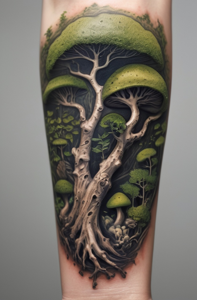
11. Cracked Stone Carving
The Brand carved into ancient stone with cracks spreading outward. This design gives the impression of an ancient relic or forgotten monument.
The weathered stone effect works especially well in grayscale on forearms or shoulder blades.
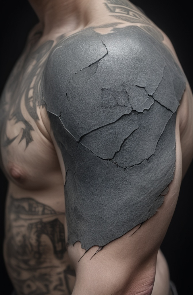
12. Eclipse Moon Phase
The Brand integrated into a moon phase design, with the Eclipse represented as the blood-red full moon. Smaller moons leading up to and after the Eclipse create a timeline effect.
This works beautifully as a band around the arm or along the collarbone.
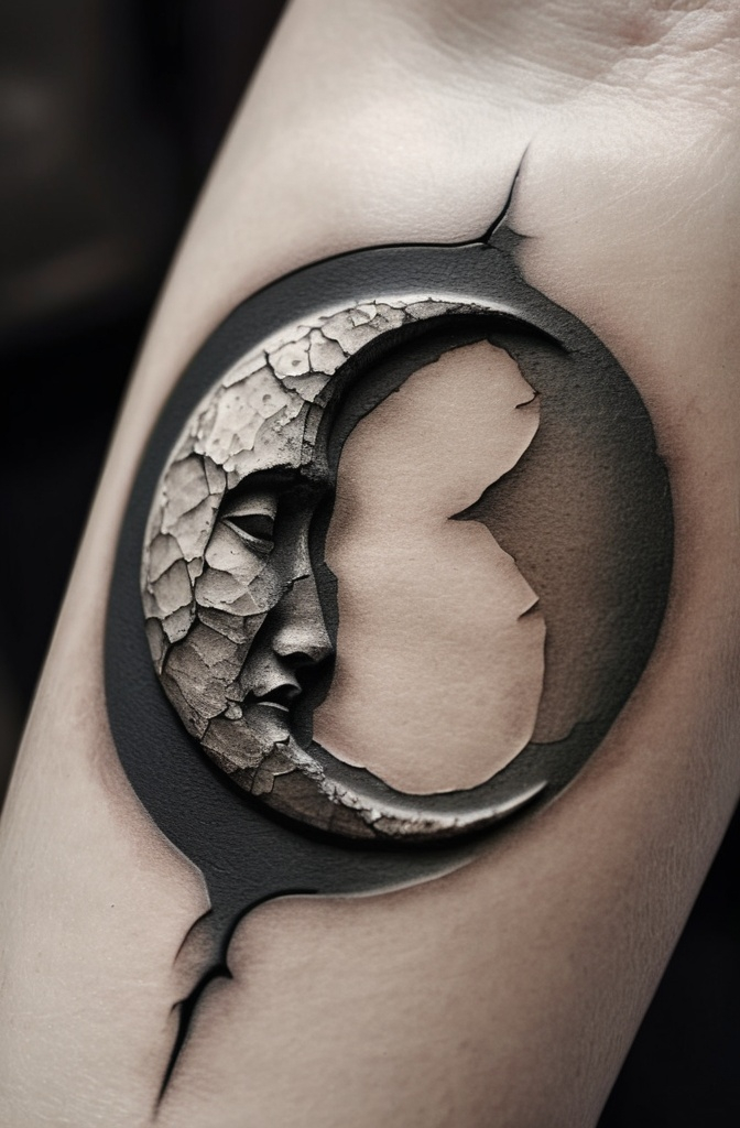
13. Stained Glass
The Brand rendered in a stained glass style with deep reds and blacks. Light appears to shine through the “glass” sections creating a haunting glow effect. Perfect for those wanting something colorful yet still darkly themed.

14. Wood Burn Style
Designed to look like it’s been burned into wood, complete with char marks and grain texture. This rustic approach gives an earthy, primal feel to the symbolic mark.
Works well on chest or back where there’s room for wood grain detail.
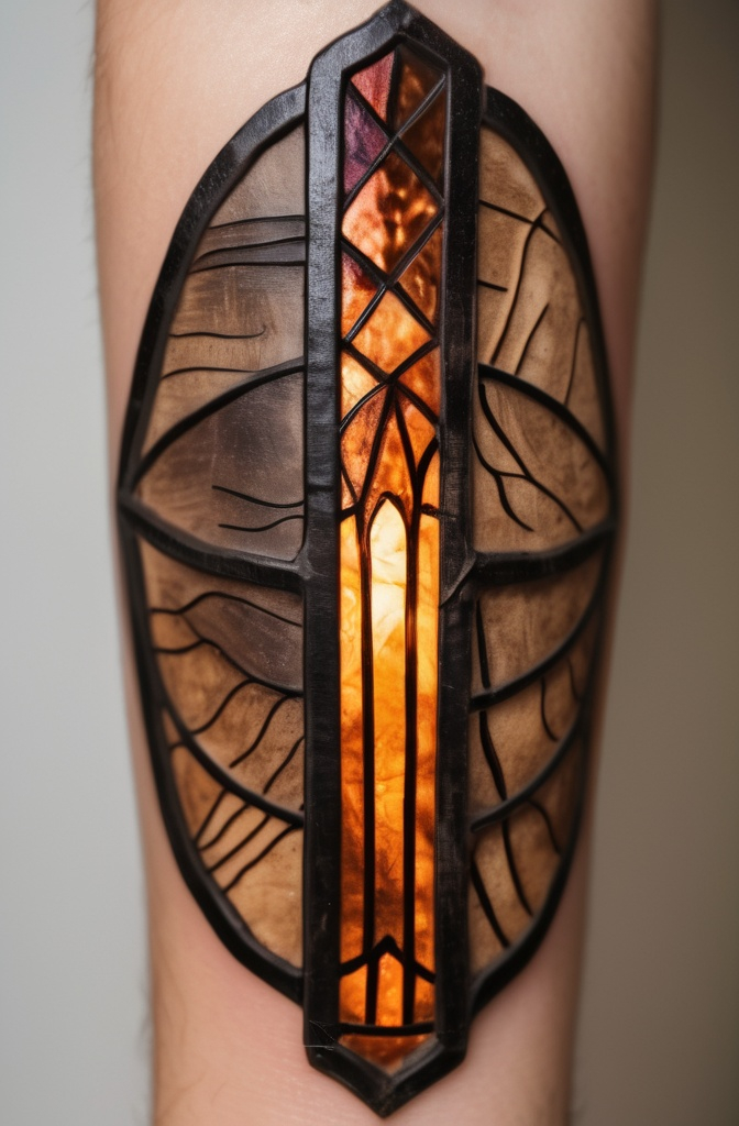
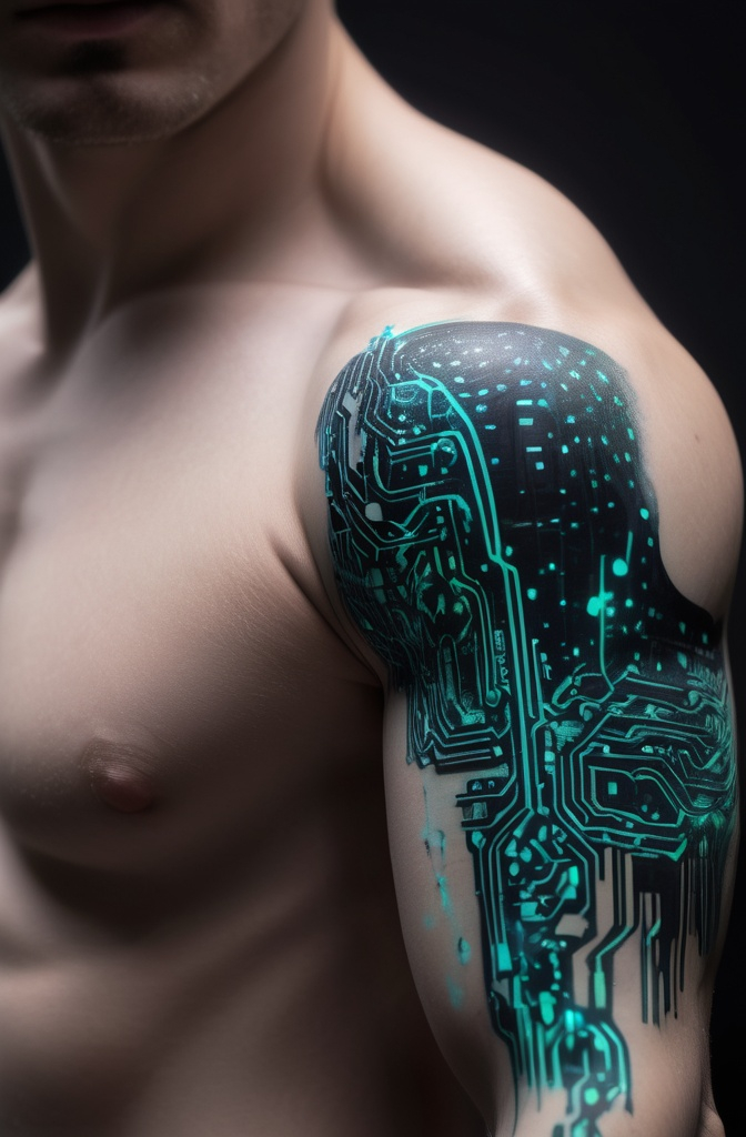
15. Circuit Board Integration
The Brand reimagined with circuit-like lines extending from it, blending dark fantasy with cyberpunk aesthetics. Thin blue or green lines contrast against the black Brand symbol.
This fusion style appeals to fans who appreciate both genres.
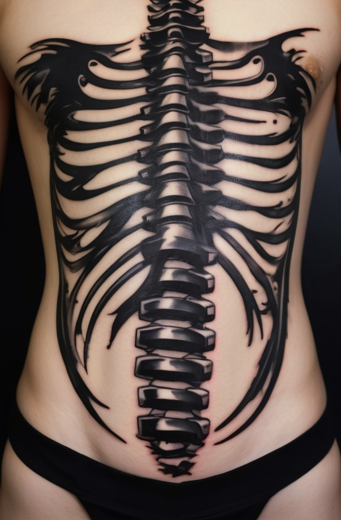
16. Brush Stroke/Sumi-e
Created in Japanese brush painting style with thick and thin strokes giving an impression of quick, decisive marking.
The ink appears to bleed slightly at the edges like traditional calligraphy. This artistic approach honors Berserk’s Japanese origins.
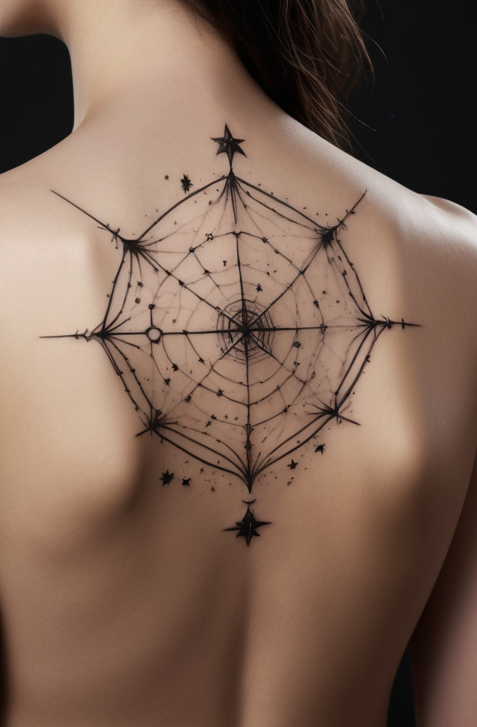
17. Constellation
The Brand formed by stars connected with faint lines, as if it’s a constellation in the night sky. Small dots of white highlight the major points of the symbol against a dark background.
This subtle approach works well for those wanting something less obvious.
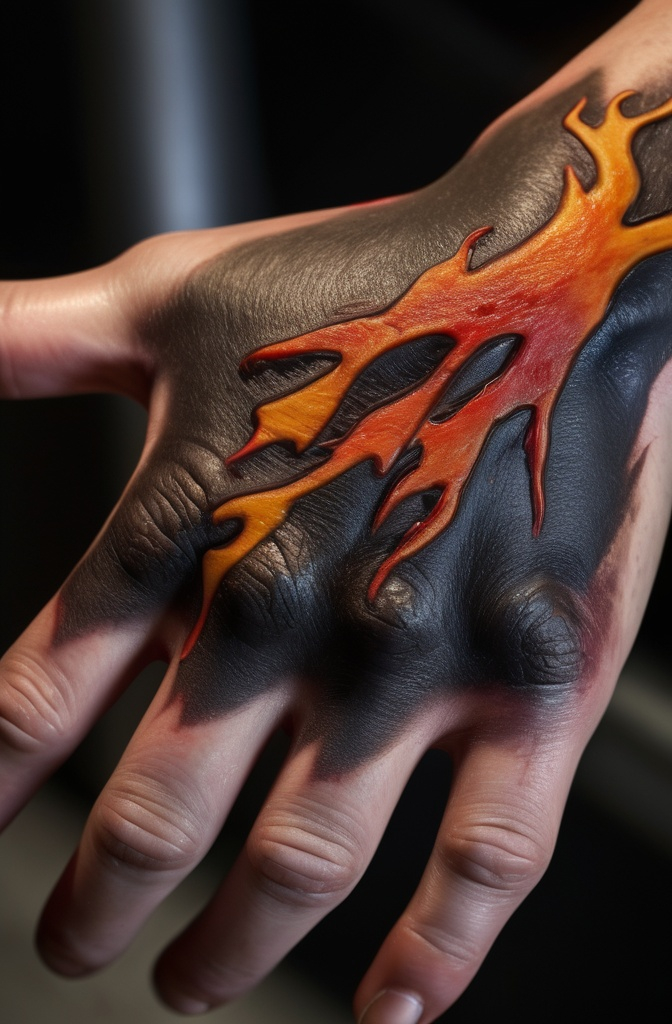
18. Burning Brand
Designed with flames emerging from the edges, suggesting active branding or supernatural heat. Orange and yellow gradients create the illusion of fire consuming the edges.
This dynamic design captures the moment of receiving the mark rather than its aftermath.
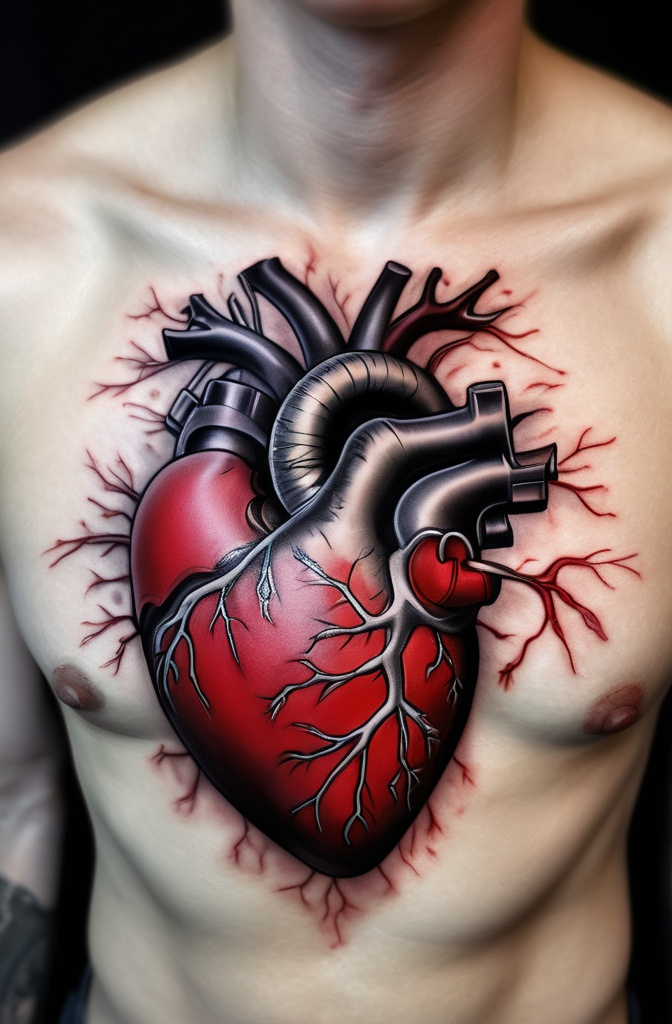
19. Anatomical Heart Integration
The Brand appearing to be carved into or emerging from an anatomical heart. Red and black ink create depth while maintaining the medical illustration style.
This represents the emotional sacrifice themes in Berserk on a visceral level.
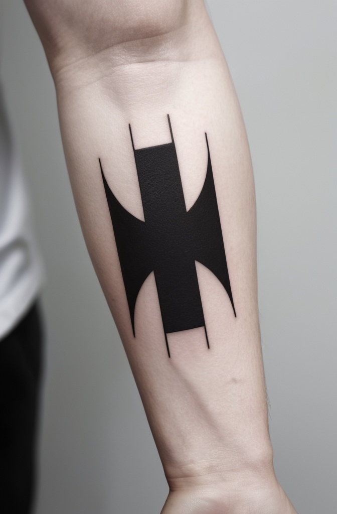
20. Negative Space
Created primarily through negative space, where the surrounding area is inked but the Brand itself remains skin tone. This reverse approach creates a striking visual effect especially on darker ink backgrounds.
Looks particularly effective when surrounded by dot work or geometric patterns.
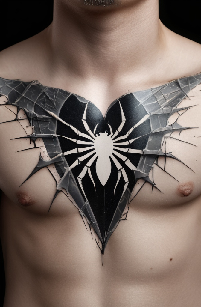
21. Broken Mirror Effect
The Brand appearing as if reflected in shattered mirror fragments. Each piece shows a different portion of the symbol with subtle light reflections.
Creates an unsettling visual metaphor for a fractured reality.
22. Musical Staff Integration
The Brand incorporated into a musical staff with the lines of the symbol forming musical notes. Dark red accents highlight key points of the design.
Perfect for fans who connect with Berserk’s haunting soundtrack.

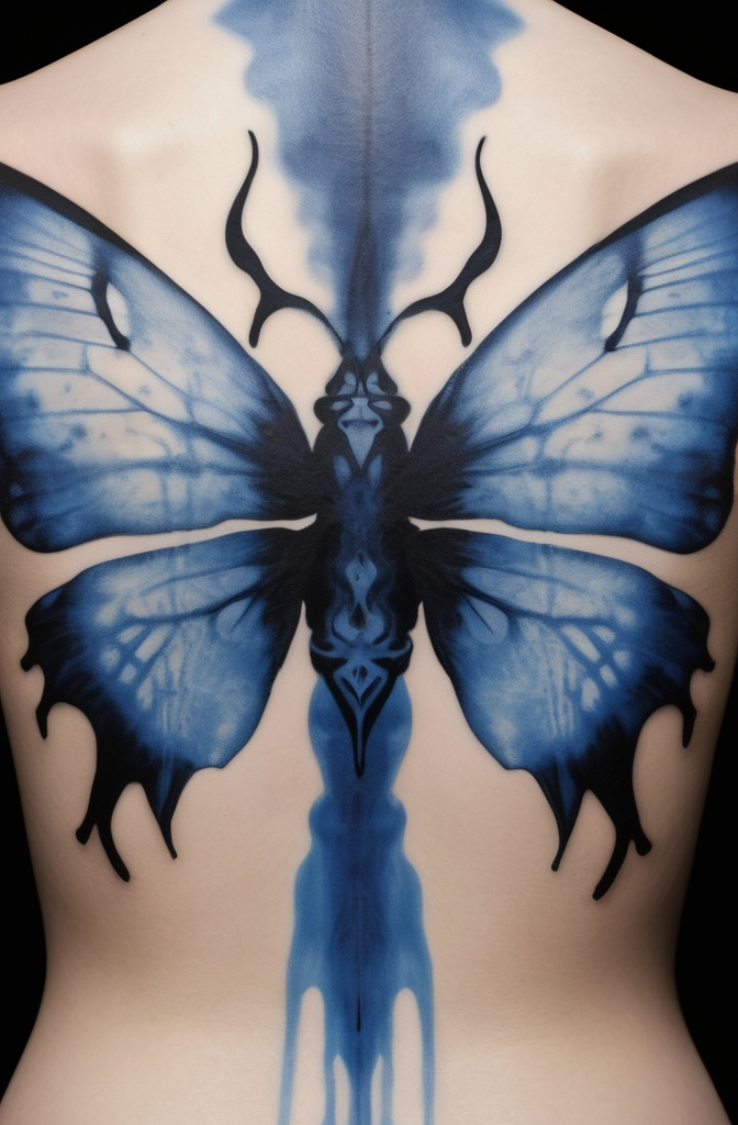
23. Ink Blot/Rorschach Style
The Brand designed to look like an ink blot test with symmetrical spreading patterns.
The core symbol remains recognizable while edges bleed outward in organic patterns. Psychologically intriguing interpretation.
24. Topographical Map
Rendered as if it were a topographical map with elevation lines radiating from the Brand. Small numbers indicate “depths” around the symbol’s edges.
Represents the Brand as a landmark in one’s personal journey.
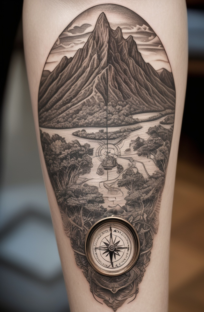
25. X-Ray Vision
The Brand appearing as if seen through an X-ray, with bone structure visible beneath it.
White and blue highlights create medical imaging aesthetic. Suggests the mark penetrates to the skeletal level.
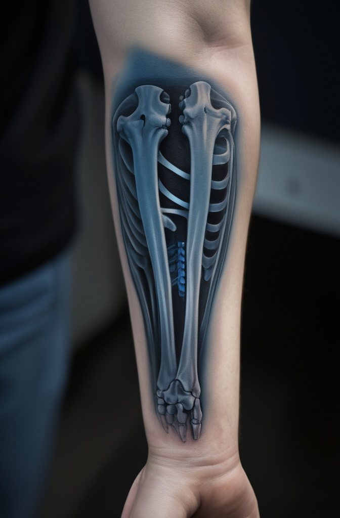
26. Vintage Woodcut Print
Designed in the style of old woodcut illustrations with characteristic hatching and cross-hatching techniques.
Slight imperfections in the lines give an authentic hand-carved appearance. Connects the Brand to classical artistic traditions.
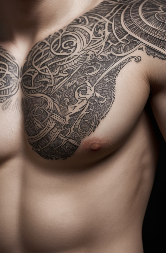
27. Chemical Burn
The Brand rendered as a chemical burn with bubbled skin texture and discoloration around edges.
Various flesh tones create realistic scar tissue appearance. Particularly effective with slight raised texture techniques.
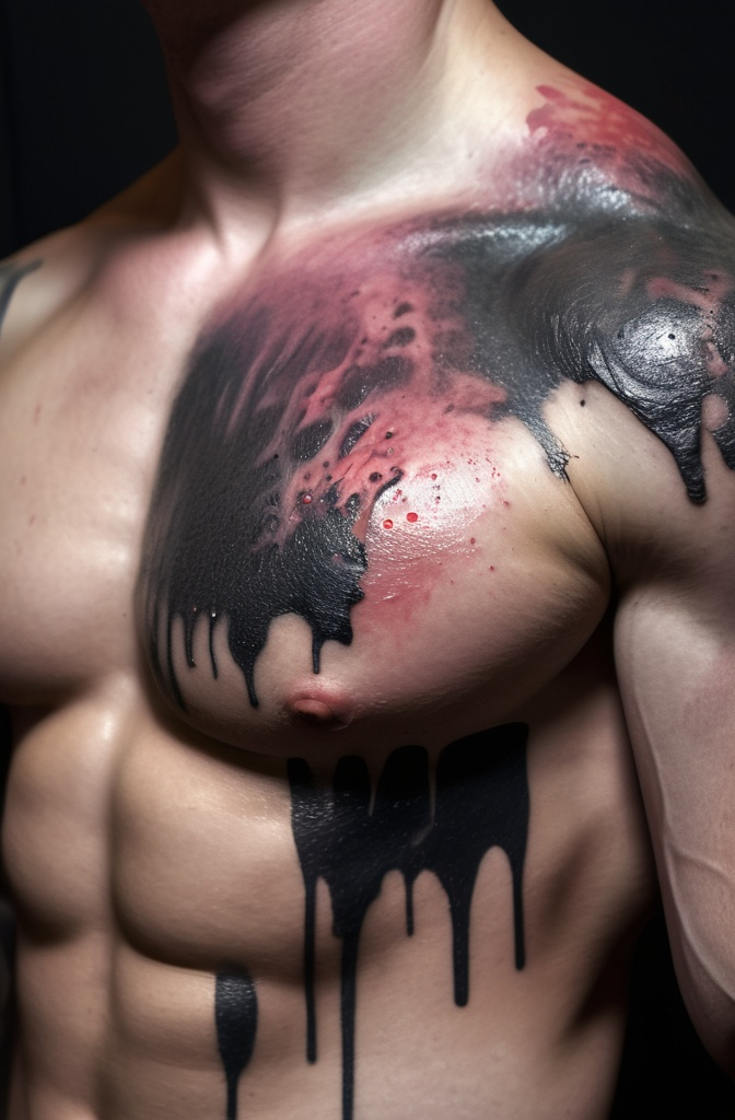
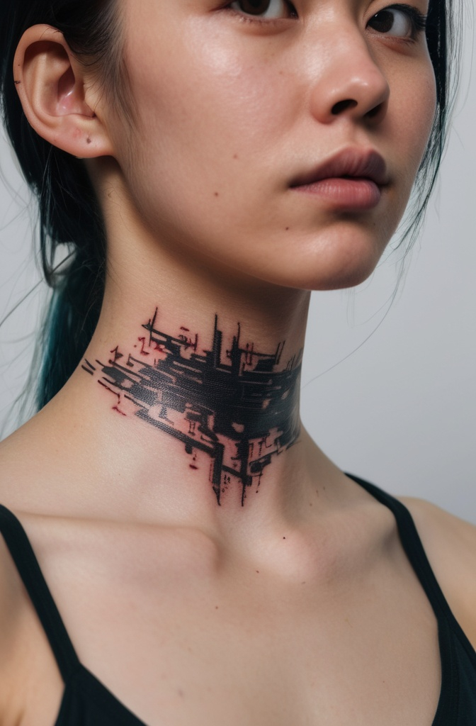
28. Corrupted Digital File
The Brand appearing glitched or corrupted, with digital artifacts and pixel distortion.
Parts of the symbol shift or duplicate like a broken image file. Perfect for tech-minded fans who appreciate digital aesthetics.
29. Primordial Soup
The Brand emerging from or dissolving into a primordial ooze of cellular structures.
Microorganisms and DNA-like spirals intertwine with the symbol’s lines. Represents the Brand as a fundamental force of creation/destruction.

30. Solar Eclipse Corona
The Brand incorporated into a solar eclipse design where the corona rays form the outer points of the symbol.
The black disc of the eclipse forms the central element. Astronomical interpretation connects to Berserk’s cosmic horror themes.

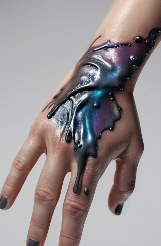
31. Liquid Mercury Brand of Sacrifice Tattoo
The Brand appearing as if formed from flowing liquid mercury. Reflective silver-gray ink creates a metallic appearance with droplets seeming to separate from the main design.
The symbol appears to be in constant flux, never fully solidified.
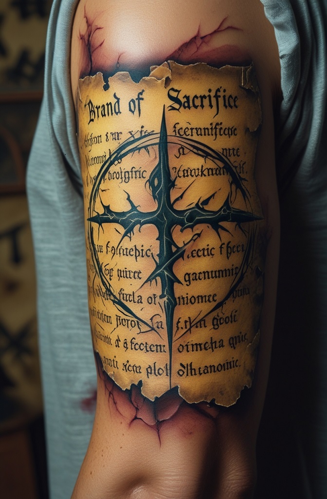
32. Forbidden Grimoire Page
The Brand integrated into a weathered page from an ancient forbidden text.
Faded Latin or runic text surrounds the symbol with aged paper texture and torn edges. Small red wax seal or burn marks add authenticity to the occult document aesthetic.
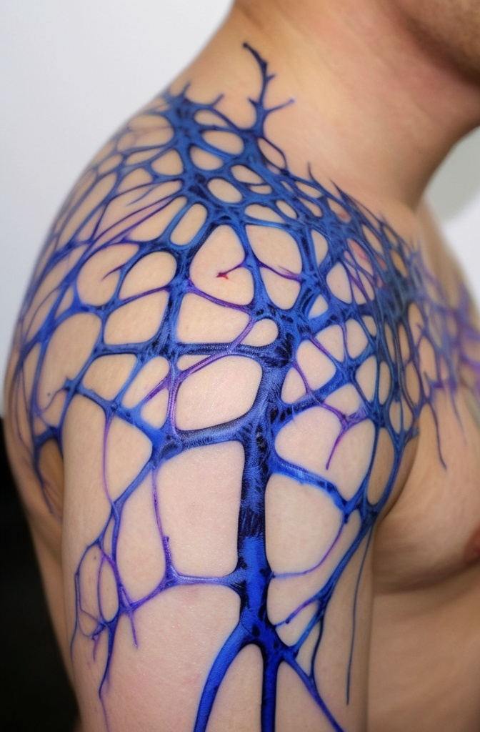
33. Neural Network
The Brand serving as the central node in a neural network design. Thin lines extend outward connecting to smaller nodes that represent significant moments or characters from Berserk.
This interconnected design symbolizes how the Brand links various fates together through causality.
Final Words: Brand of Sacrifice Tattoo
A Brand of Sacrifice tattoo represents more than just fandom. It carries the weight of Berserk’s themes of struggle, perseverance, and defiance against fate. Many bearers find personal meaning in these themes, seeing the brand as a symbol of their own battles.
Work closely with an artist who understands both technical requirements and the symbol’s significance. The most succesfull pieces honor the source material while incorporating elements that resonate personally.
Remember that like Guts himself, you’ll carry this mark for life choose a design you’ll be proud to bear on your journey.
